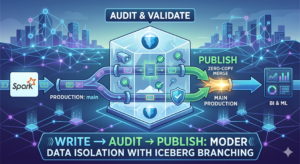
How to Visualize Monthly Expenses in a Comprehensive Way: Develop a Sankey Diagram in R

Photo by Choong Deng Xiang on Unsplash

Visualizing the monthly cash flow isn’t new if you use personal budgeting/finance tools like Mint/Personal Capital/Clarity. All those tools primarily provide three types of charts: pie charts, bar charts, and line charts. However, have you ever wondered if charts are good enough to get better ideas about your monthly income and expense? Are there ways to visualize monthly expenses comprehensively? In this article, I will share with you how to create a Sankey Diagram In R to help better you gain more insights into your financial situation.

What Is Sankey Diagram

From Wikipedia: Sankey Diagrams are flow diagrams in which the width of the arrows is proportional to the flow rate. One of the famous Sankey diagrams is Napoleon‘s invasion of Russia. The diagram below clearly shows the time and number of troops left. 

Minard's classic diagram of Napoleon's invasion of Russia

Back to personal finance monthly cash flow, it is a perfect use case to adopt the Sankey diagram to demonstrate the cash flow and which account the money originates from or goes to. 

The pie and bar charts in the Mint App don’t show how cash flows but the amount of money spent/earned in one category, which is one of the limitations to deep dive your personal finance by cash flows.

Here is one of the nice Sankey diagram on Reddit. Our goal in this article is to recreate a similar one with a data dump from a personal finance app like Mint. 

Sankey Diagram - Income From Reddit

Prerequisite

Although it requires you to install R to get better-customized results, you can add little code yourselves, and having a deep understanding of R is not required. You can copy & paste the code from this post. 

You’d need to install R and RStudio to get the best experience in R

How To Download Your Monthly Transactions From Mint

We will use Mint.com as an example to download the transactions. It is straightforward from the web application, and the mobile APP doesn’t have this option. Once you log on to Mint, go to TRANSACTIONS, scroll to the button, and you should see an option “export all xxx transactions.” A CSV file will be downloaded when you clicked on that option.

The downloaded CSV file has the following fields: Date, Description, Original Description, Amount, Transaction Type, Category, Account Name, Labels, Note. We will use Amount, Transaction Type, Category, Account Name to build the Sankey Diagram.

Create Sankey Diagram In R and ggplot2​

One of the libraries we will use to build the Sankey diagram is ggalluvial. The design and functionality were inspired initially by the alluvial package. One of the great things about ggalluvial is that it builds on top of ggplot2, and you can get the benefit of the grammar of graphics

				
					library(ggplot2)
library(dplyr) 
library(ggthemes)
library(ggalluvial)
df = read.csv("~/Downloads/transactions.csv")
df <- df %>% 
  select(Date, Amount, Category, Transaction.Type, Account.Name) %>% 
  mutate(Date=as.Date(Date, format="%m/%d/%Y")) %>% 
  filter(Date > as.Date('12/01/2021', format="%m/%d/%Y")) %>% 
  group_by(Category, Transaction.Type, Account.Name) %>% 
  summarise(Expense = sum(Amount)) %>% 
  filter(Expense > 100, Transaction.Type == "debit", !Category %in% c("Transfer", "Paycheck", "Credit Card Payment", "Mortgage & Rent", "Investments"))
  
ggplot(df, aes(axis1 = Transaction.Type, axis2 = Account.Name, axis3 = Category, y = Expense)) +
  scale_x_discrete(limits = c("Transaction.Type", "Account.Name", "Category"), expand = c(.2, .05)) +
  geom_alluvium() + 
  geom_stratum() + 
  geom_text(stat = "stratum", aes(label = after_stat(stratum))) +
  theme_economist() + 
  scale_colour_economist()


The code above can be broken down into 3 categories:

  1. Import libraries and read the downloaded CSV file
  2. Transformation: we selected only the needed fields; converted the timestamp from string to date; sum the dollar amount group by transaction type, account name, and category. The group by the condition is to help build the Sankey diagram stages.
  3. Build the data visualization: all we have to do is put the group by condition into axis, then name the field we’d like to see the flows in scale_x_discreteand then call ggalluvialto start building the chart.
Now we can visualize the diagram as follows, which clearly shows the cash flow on each category which account they are coming from and how each category is distributed. 
Sankey Diagram Mint By R | Image By Authoer

Create Sankey Diagram Without Coding​

There is also a website called sankeymatic.com that provides a no-coding option for drawing a nice Sankey diagram. It requires the user to format the input in a certain way, and then you should have the same result as the above Reddit post.

Sankey Diagram | Image from https://sankeymatic.com/

Final Thoughts

The personal finance app provides a quick easy data visualization, but it limits itself to advanced comprehensive usage like cash flow analysis. I hope this article complements this area of your personal finance analysis. Please let me know what you think about the Sankey diagram and using R to build such an excellent chart by leaving a comment below.

About Me

I hope my stories are helpful to you. 

For data engineering post, you can also subscribe to my new articles or becomes a referred Medium member that also gets full access to stories on Medium.

In case of questions/comments, do not hesitate to write in the comments of this story or reach me directly through Linkedin or Twitter.

More Articles

Source: Aron Visuals from Unsplash

Airflow Schedule Interval 101

The airflow schedule interval could be a challenging concept to comprehend, even for developers work on Airflow for a while find difficult to grasp. A confusing question arises every once a while on StackOverflow is “Why my DAG is not running as expected?”. This problem usually indicates a misunderstanding among the Airflow schedule interval.

Read More »

Leave a Comment

Your email address will not be published. Required fields are marked *

Scroll to Top
Share via
Copy link